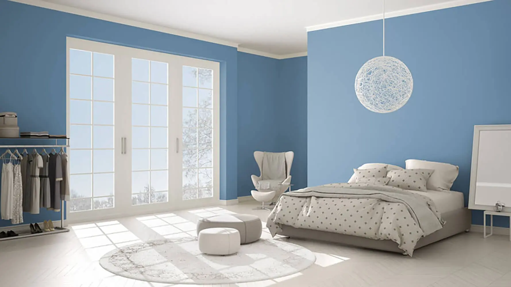
How to Choose Exterior Paint Colors for Your Home
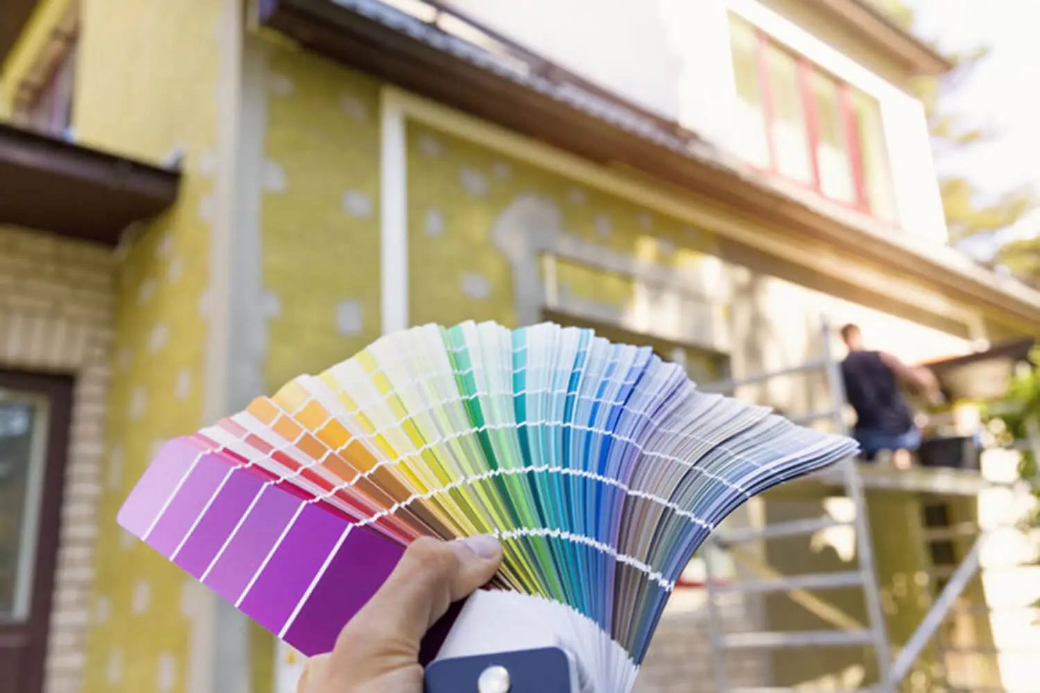
Choosing an exterior paint color should be exciting. For most homeowners, it ends up being stressful. The options feel endless, the stakes feel high, and the fear of making an expensive mistake in front of the entire neighborhood is real.
The good news is that color selection becomes much more manageable when you stop trying to find the perfect color and start working through the right filters. Your home already has characteristics that narrow the field considerably. Understanding those characteristics is where the process begins.
Start with Your Home’s Architectural Style
Architectural style is the first filter because different styles have established color logic built into their proportions, details, and materials. Understanding that logic before you start picking colors saves a lot of wasted effort.
Here is how common residential styles tend to respond to color:
- Craftsman — earthy greens, warm browns, and muted neutrals complement the horizontal lines, natural materials, and handcrafted details
- Colonial — classic whites, soft grays, and navy reinforce the symmetry and formality of the style
- Victorian — the ornate details and complex facades support more colors, more contrast, and more personality than almost any other residential style
- Modern and Contemporary — clean palettes, fewer colors, and strong contrast between body and trim work best; too many colors fragment the clean lines that define the style
The goal is not to follow convention without question. It is to understand what your architecture is asking for before you decide how far to deviate from it. A color that works against the style of the home will feel off even if no one can immediately explain why.
Work Around Your Fixed Elements
Fixed elements are the parts of your home that will not change when you repaint. The roof, brick, stone, masonry, concrete, and hardscaping all stay in place and they all have to be treated as anchor points in your color decision. Every color choice you make needs to work with these elements, not fight against them.
Roofing Color and Material
The roof is often the largest fixed element visible from the street, which makes it the most important anchor point to work from.
- Dark charcoal or black roofs are the most flexible and pair well with a wide range of body colors, particularly lighter neutrals and whites
- Warm brown or tan roofs push the palette toward earthy tones and make cool grays and blues difficult to pull off
- Red or terracotta roofs limit the field most significantly — greens, creams, and warm neutrals tend to work; cool blues and grays tend to clash
Brick, Stone, and Masonry
Homes with brick or stone accents need paint colors that complement the undertones already present in those materials.
- Warm-toned brick with orange or red undertones pairs with warm creams, tans, and greens — cool grays and stark whites create a tension that rarely resolves well
- Gray or blue-toned stone reads better with cooler palettes and softer whites
- The mistake to avoid is choosing a body color that competes with the masonry rather than working alongside it
Concrete, Driveways, and Hardscaping
Concrete paths, driveways, and retaining walls sit in the same visual frame as the house and are easy to overlook until the paint is on the wall. Warm beige or tan concrete reads differently than cool gray concrete, and the body color needs to account for both. The same applies to landscaping. A yard with warm-toned plantings and mulch creates a different context than one with cool greens and stone, and those surroundings influence how the house color reads from the street.
Understand How Light Affects Exterior Color
The single most common source of color disappointment is the gap between how a color looks on a chip or a screen and how it looks on the actual exterior of a home in natural light. That gap can be significant.
A few things to understand about how light behaves on exterior surfaces:
- North-facing walls that sit in shade read cooler and darker than the same color on a south-facing wall in full sun
- In Utah, high-altitude sun is more intense than most homeowners expect — dark body colors can look more saturated and dramatic than they appeared in the store
- Light colors reflect that sun and often read lighter and brighter on the wall than anticipated
- The same color can feel warm at noon, flat in the morning, and slightly different again on an overcast afternoon
The practical implication is straightforward. Before committing to a color, evaluate physical samples on the actual surfaces of your home at different times of day. Seeing the color across multiple conditions before making a final decision is the only reliable way to avoid surprises.
Consider Your Neighborhood Without Being Constrained by It
Neighborhood context matters for two reasons. The first is resale value. A home that clashes sharply with its surroundings can affect buyer perception regardless of how well the paint job itself was executed. The second is visual harmony. Streets develop a visual rhythm over time, and a home that disrupts that rhythm tends to feel out of place rather than distinctive.
The goal is not to match your neighbors. It is to be complementary. If the street is predominantly warm neutrals, a cool gray can work well. A jarring bright color is harder to pull off without the house feeling disconnected from its setting.
Before committing to any direction, check whether your community has HOA restrictions on exterior colors. Some Utah neighborhoods specify approved palettes, and selecting a color without verifying this first risks a required repaint at your expense. It is one of the first things to confirm, not an afterthought.
Within whatever guardrails apply, personal expression belongs in the details. The front door, trim, and accent colors are the right places to introduce personality without disrupting the overall composition of the street.
How to Build a Color Scheme Across Body, Trim, and Accents
Most exterior color schemes involve three components:
- Body — the dominant color covering the majority of the exterior surface, chosen first because it sets the tone for everything else
- Trim — defines the edges, windows, and architectural details; creates either contrast or continuity with the body
- Accent — one color applied to the front door, shutters, or other focal points to introduce personality
A few principles that make this easier:
- White and off-white trim is the most versatile option and works alongside almost every body color
- Keeping trim in the same color family as the body but at a lighter or darker value produces a more unified, quieter look
- Accent colors work best when they pick up on an undertone already present in the body color or in the fixed elements rather than introducing something unrelated
- Limiting the scheme to three colors — body, trim, and one accent — keeps the composition from feeling busy or unresolved
Test Colors Before You Commit
Paint large sample boards and hang them directly on the walls of your home. Small chips at the paint counter cannot replicate how a color reads at scale on an exterior surface, and neither can a screen. The only reliable test is a physical sample in the actual environment.
Digital visualizer tools from major paint brands let you upload a photo of your home and test colors virtually. These are useful for narrowing down a long list before you invest in samples, but they are not a substitute for physical testing.
Once your sample boards are up, give them time. Evaluate them:
- In the morning when light is soft and directional
- At midday when sun is direct and colors appear most saturated
- In the late afternoon when warm light shifts the tone
- On an overcast day when colors flatten and read closer to their true value
A decision made under a single set of conditions will almost always look different once the paint is on every wall.
How to Choose Exterior Paint Colors with Confidence
The right exterior color does not come from finding the most appealing option in a color catalogue. It comes from working through a specific set of filters: what the architecture supports, what the fixed elements require, how light behaves on your specific walls, what the neighborhood context allows, and how the body, trim, and accent colors relate to each other.
A color that clears all of those filters will look intentional. It will complement the character of the home and hold up visually for years without feeling like a mistake you are waiting to correct.
For homeowners who want help working through that process, a professional color consultation as part of the estimate takes the guesswork out of the decision and makes sure the direction is right before any paint goes on the wall. We offer color guidance alongside every exterior painting estimate. Contact Urban Painting Company to schedule yours.