How to Make a Small Room Look Bigger with Paint
A small room that feels cramped is frustrating, especially when you know the space has potential. Before you start moving walls or rearranging furniture, paint is worth serious consideration. The right color decisions can genuinely change how a room reads, making it feel more open, taller, and less confined than it actually is.
The problem is that most paint advice for small rooms stops at “use a light color.” That is a starting point, not a strategy. Color, sheen, trim treatment, and ceiling color all work together to affect how a space reads. Getting one right and ignoring the others produces a result that falls short of what paint can actually do.
This post walks through each of those decisions so you can approach your small room with a clear framework rather than a guess.
Start with Light Colors but Understand Why They Work
Light colors are the standard advice for small rooms and the advice holds up, but understanding why they work helps you apply the principle more effectively than simply reaching for white.
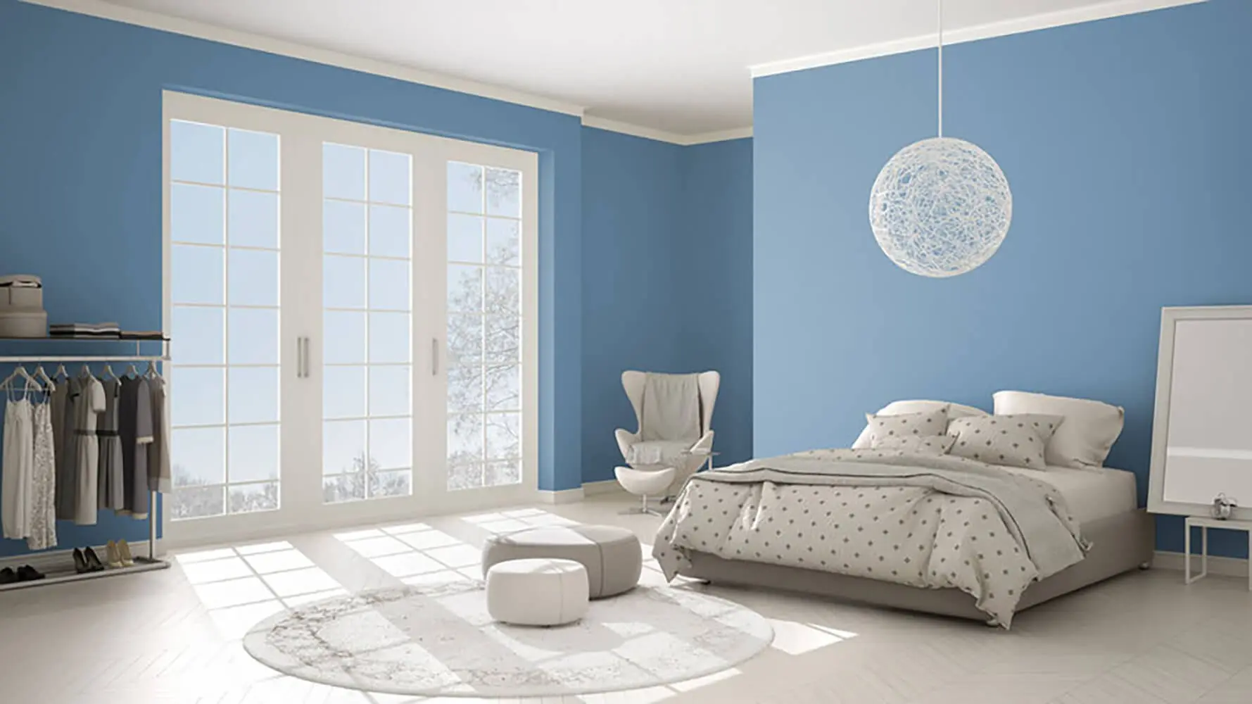
Light colors reflect more natural and artificial light back into the room. That reflected light reduces the sense of enclosure and makes walls feel further away than they physically are. The effect is not just psychological. It is a direct result of how much light a surface bounces back into the space versus absorbs.
The effect is strongest with colors that have cool undertones. Cool colors recede visually, meaning the eye reads them as being further away than they are:
- Soft blues
- Muted greens
- Cool whites and grays
- Pale blue-grays
Warm light colors work differently. Creams, soft yellows, and warm whites still open up a space but are a better choice when the room has limited natural light. A cool white in a north-facing room with no windows can feel cold and flat rather than open and airy. A warm cream in the same room feels more balanced.
The mistake most homeowners make is choosing a color based on how it looks on a chip or screen. Undertones shift significantly on a full wall and in the specific light conditions of the room. What looks like a soft gray on a chip can read as lavender on a wall, or what looks like a warm white in the store can feel yellow under certain lighting. Always test before you commit.
Use a Monochromatic Scheme to Eliminate Visual Interruption
Every time the eye encounters a color change it registers a boundary. In a small room, those boundaries make the space feel more divided and therefore smaller. A wall color that changes to a different ceiling color creates a boundary at the top of the room. Trim in a contrasting color creates a boundary at every edge. The more boundaries, the more the eye stops, and the more confined the room feels.
A monochromatic scheme removes those stops. Using one color or closely related tones across the walls allows the eye to travel continuously around the room without interruption. The space reads as one unified surface rather than a collection of separate planes.
The effect compounds when you extend the same color to the ceiling:
- The hard line between wall and ceiling disappears
- The room reads as taller because there is no visual stop at the top
- The space feels like a continuous volume rather than a box with a lid
Monochromatic does not mean flat or featureless. Varying sheen levels across surfaces within the same color family adds dimension and interest without reintroducing the visual interruptions that make small rooms feel smaller.
Sheen Matters as Much as Color
Sheen determines how much light a painted surface reflects, which directly affects how open or enclosed a room feels. Two rooms painted the same color but in different sheens will read differently, sometimes dramatically so.
Higher sheens reflect more light and make surfaces feel further away. In small rooms the difference between a flat finish and a satin finish on the same color is noticeable:
- Flat and matte finishes absorb light, which makes surfaces feel closer and the room feel heavier. The color may be right but the sheen is working against it.
- Eggshell finishes offer a slight reflectivity that opens the room without drawing attention to surface imperfections.
- Satin finishes reflect more light and are more durable, making them a strong choice for small rooms that see regular use.
- Semi-gloss finishes on ceilings specifically draw the eye upward and create a sense of height through reflected light at the ceiling level.
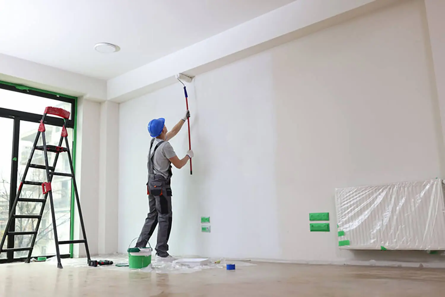
Sheen selection should be a deliberate decision made alongside color selection. Choosing the right color and then defaulting to flat paint because it is the standard wall finish undermines the work the color is doing. Sheen also plays a significant role in how long interior paint lasts, making it a decision that affects durability as much as appearance.
Paint the Ceiling Strategically
The ceiling is one of the most underused surfaces in a small room. Most homeowners paint it white without considering whether that choice is actually serving the space. How the ceiling is painted significantly affects the perceived height and volume of the room.
Three approaches, each producing a different result:
- Same color as the walls or one shade lighter — removes the hard visual boundary between wall and ceiling, allowing the eye to read the room as taller. The room feels like one continuous space rather than a room with a ceiling sitting on top of it.
- Noticeably lighter than the walls — draws the eye upward and creates a sense of lift. This is the most reliable ceiling technique for rooms that feel both low and small. The contrast between wall and ceiling directs attention upward without creating a hard stop.
- Darker than the walls — makes the room feel more intimate and cozy but works directly against the goal of making the space feel larger. This is the right choice when intimacy is the priority, not spaciousness.
Most small rooms benefit from either of the first two approaches. The choice between them depends on whether the room needs to feel taller or simply more open.
How Trim Color Affects Perceived Room Size
Trim color is where many small room paint decisions fall apart. A homeowner chooses the right wall color, applies it well, and then paints the trim bright white because that is what trim is supposed to look like. The bright white trim undoes a significant portion of what the wall color was accomplishing.
High-contrast trim creates a strong visual boundary at every edge of the room. Every door frame, window frame, and baseboard becomes a stop for the eye. The room reads as more segmented because it is, visually. Those segments feel smaller than the room as a whole.
Baseboards are a specific example worth understanding. A stark white baseboard against a colored wall cuts the room horizontally at floor level. That horizontal line visually lowers the ceiling because it shortens the uninterrupted vertical surface of the wall.
The more effective approach for small rooms:
- Paint trim in the same color as the walls or in a slightly lighter or darker value of the same color
- Treat walls, trim, and ceiling as one continuous surface in the same color family
- Reserve contrast for intentional focal points rather than applying it to every edge in the room
Removing trim contrast is one of the highest-impact changes a homeowner can make in a small room without changing the wall color at all.
When Accent Walls and Contrast Actually Work in Small Spaces
The advice to avoid dark or bold colors in small rooms is not absolute. Contrast and accent colors can work in small spaces when applied with intention rather than against it.
An accent wall on the wall directly opposite the entry point of the room draws the eye to the far end of the space. That visual pull creates a sense of depth and makes the room feel longer than it is. The key is placement:
- Opposite the entry point — draws the eye forward, creates depth, makes the room feel longer
- On a side wall — shortens the room visually rather than lengthening it, which is the opposite of the intended effect
Dark colors on a single accent wall do not make a room feel smaller when the remaining walls are light. The contrast creates perceived depth at that surface rather than a sense of enclosure across the whole room.
Color applied to recessed surfaces, like the inside of a built-in or the back of an alcove, creates perceived depth at those specific points without affecting the perceived perimeter of the room. The eye reads the darker recessed surface as being further back than it is, which adds a sense of dimension to an otherwise flat space.
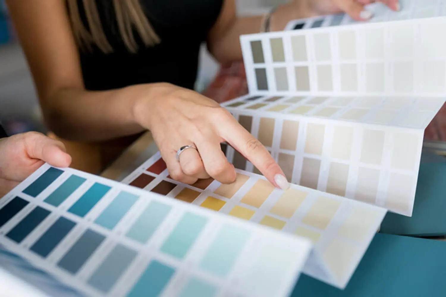
Test Colors Before You Commit
Paint decisions in small rooms are less forgiving than in large ones. A color that reads fine in a spacious room can feel oppressive in a tight space, and the undertones that seemed subtle on a chip can dominate an entire wall. Testing is not optional in a small room.
How to test effectively:
- Paint large sample boards rather than small chips and hang them on multiple walls in the room
- Evaluate samples on walls that face different directions since colors read differently based on how much light each wall receives
- Look at the samples at different times of day, morning, midday, and evening, and under both natural and artificial light
- Colors always look more intense on a full wall than on a small sample, so when in doubt go one shade lighter than the sample that looks right in the store
A professional color consultation as part of the estimate process removes most of the guesswork. A painter who understands how color behaves in a specific room can narrow down the options before any paint goes on the wall, saving the homeowner from buying samples of colors that were never going to work in that space.
Getting the Most Out of Paint in a Small Room
Making a small room feel bigger with paint is not a single decision. It is a set of decisions that work together. The right color with the wrong sheen, or the right sheen with high-contrast trim, produces a result that falls short of what the room is capable of. The techniques covered here compound when applied together and undermine each other when applied selectively.
Color, sheen, ceiling treatment, trim color, and contrast placement all affect how a small room reads. Getting all of them working in the same direction is what produces a room that genuinely feels larger than it is.
If you want specific recommendations for your space before committing to a color direction, we offer color consultations as part of every interior painting estimate. Contact us today to schedule yours.