How to Choose Interior Paint Colors You Will Actually Love
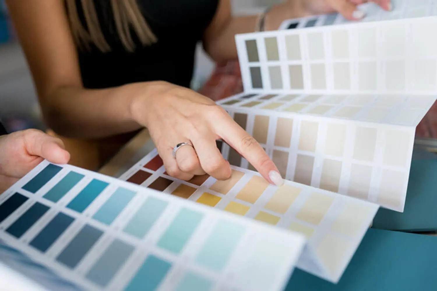
Standing in a paint store surrounded by hundreds of color chips is one of the more overwhelming experiences a homeowner can have. Every chip looks plausible in the store. Many of them will look completely wrong on the wall. And the gap between what looked good on a chip and what actually works in a room is where most paint color regrets are born.
The homeowners who end up happy with their color choices almost always approached the decision the same way. They started with the room and worked outward to find a color that fits it. The ones who ended up repainting started with a chip they liked and tried to make the room work around it.
This post gives you a practical framework for making color decisions that hold up once the paint is on the wall.
Start with What Is Already in the Room
Before you look at a single paint chip, look at the room. The flooring, countertops, tile, cabinetry, and any built-in furniture are fixed elements that are not changing with the paint. The wall color has to work with them, not the other way around.
Start by identifying the dominant colors and undertones already present in those fixed elements:
- A warm-toned wood floor with golden or orange undertones
- A cool gray countertop with blue or green undertones
- A beige tile that pulls pink or yellow depending on the light
- A brick fireplace surround with red and orange tones
These elements are the anchors. The wall color needs to complement them, not compete with them. The paint is not the star of the room. It is the backdrop that makes everything else work together.
A practical move before going to the paint store: bring a fabric swatch, a tile sample, or a clear photo of the flooring with you. That single step narrows the field from hundreds of options to a manageable range that has a real chance of working in the actual space.
Understand How Undertones Work Before You Pick a Color
Undertones are the subtle secondary colors that exist within every paint color, and they are responsible for most color disappointments. The white that looks pink on the wall. The gray that reads purple. The beige that somehow feels orange. In every case, the undertone was there on the chip. It just was not visible until the color hit a large surface under real lighting conditions.
Every paint color carries an undertone, including neutrals:
- Whites can pull blue, green, pink, or yellow
- Grays can read purple, blue, or green
- Beiges can feel orange, pink, or yellow depending on what surrounds them and how the light hits them
Undertones are invisible or misleading on a small chip held under store lighting. They reveal themselves fully only on a large surface in the actual lighting conditions of the room. This is why a color that looked perfect in the store can feel completely wrong on the wall. The color did not change. The conditions did.
When a color looks wrong on the wall despite looking right on the chip, the undertone is almost always the reason. Understanding this before selecting colors saves the homeowner from chasing the wrong fix, which is usually buying a new color when the real issue was the undertone direction of the original one.
The direction you choose matters. Warm undertones, colors that pull toward yellow, orange, or red, feel cozy and energizing. Cool undertones, colors that pull toward blue, green, or purple, feel calm and visually receding. The function and mood of the room should inform which direction makes sense before a specific color is ever selected.
How Lighting Changes Everything
Lighting is the single most transformative factor in how a paint color reads in a room. The same color can look completely different depending on the type and amount of light hitting the surface. Color selection without accounting for lighting produces results that are impossible to predict accurately from a chip alone.
Natural Light and Room Orientation
The direction a room faces determines what kind of natural light it receives and how that light interacts with paint color throughout the day:
- North-facing rooms receive cool, indirect light throughout the day. Colors read cooler and darker than they would in a south-facing room. Cool undertones become more pronounced, and colors that looked balanced in the store can feel cold and gray on the wall.
- South-facing rooms receive warm, direct light for most of the day. Colors read warmer and brighter than expected. A color that looks soft and subtle on a chip can feel intense and saturated on a south-facing wall in afternoon sun.
- East-facing rooms get warm morning light and cool afternoon light. Colors shift noticeably throughout the day, which means a color that feels right at 9am can feel wrong by 3pm.
- West-facing rooms get the opposite. Cool mornings and warm, golden afternoon light intensify color in the late hours of the day.
The practical implication is the same regardless of orientation: evaluate paint samples on the actual walls of the room at multiple times of day before committing. A sample that only looks right under one set of conditions is not the right color.
Artificial Light and Bulb Temperature
Artificial light has a color temperature measured in Kelvins, and it significantly affects how paint colors read after dark or in rooms without adequate natural light.
Warm bulbs in the 2700K to 3000K range cast a yellow-orange light that intensifies warm undertones and mutes cool ones. A color with warm undertones looks richer and cozier under warm light. A color with cool undertones can look muddy or washed out.
Cool bulbs in the 4000K to 5000K range cast a blue-white light that does the opposite. Cool undertones feel crisper and more defined. Warm undertones can feel harsh or push toward orange.
The bulb temperature already in the room needs to factor into color selection. A homeowner who evaluates samples only in natural daylight and then switches on warm Edison bulbs in the evening can be genuinely surprised by how different the color reads after dark.
How to Think About Color Flow Across Connected Rooms
Open floor plans and connected living spaces create a color challenge that individual room selection does not address. Colors that look great in isolation can create jarring transitions when seen together from across a shared space. Standing in a living room and looking into a kitchen or dining area puts two wall colors in the same field of view at the same time, and those colors have to relate to each other even if they are not the same.
The goal in connected spaces is not to match colors room to room. It is to ensure they share a common undertone family so they feel related even when the hues are different.
Colors from the same undertone family, all warm, all cool, or all neutral, read as cohesive when viewed together. Colors from opposing undertone families create a specific visual problem: the eye registers an unresolved conflict at the transition point, the way two colors that almost match but do not quite are more unsettling than two colors that are clearly and intentionally different.
A practical approach for connected spaces:
- Choose one anchor color for the most visible or central space first
- Select colors for adjacent rooms that share the same undertone direction as the anchor
- The colors do not need to match — they need to belong to the same visual family
- Vary the hue, value, or saturation while keeping the undertone consistent
Rooms separated by doors have considerably more independence. A closed door creates a visual break that allows for a more dramatic color shift without the transition feeling abrupt or unresolved.
How to Test Colors Before You Commit
No amount of looking at chips, scrolling through photos, or using digital visualizers replaces testing actual paint on actual walls in the actual room. Every one of those tools is useful for narrowing the field. None of them is a substitute for a physical sample under real conditions.
How to test effectively:
- Paint large sample boards rather than small sections directly on the wall. Large boards can be moved to different walls and evaluated in different lighting conditions without committing paint to every surface.
- Place boards on walls with different orientations. A north wall and a south wall in the same room can read differently enough to matter.
- Evaluate samples at multiple times of day, morning, midday, and evening, and under both natural and artificial light. A color that looks right in one condition and wrong in another is telling you something important about how it will behave once it covers the full room. The finish you choose during this stage also affects how long interior paint lasts, which is worth understanding before you commit to a sheen.
- Colors always read more intensely on a full wall than on a sample board. When a sample looks right, go one shade lighter or less saturated before committing to the full room.
- Live with the samples for at least two to three days before making a final decision. Colors that seem right on day one sometimes reveal themselves differently as the eye adjusts to seeing them at scale.
When a Professional Color Consultation Is Worth It
Some color decisions are genuinely difficult, and recognizing when expert input is worth pursuing saves time and money compared to the cycle of testing, rejecting, and starting over.
Color consultation is worth considering when:
- The room has complex fixed elements with competing undertones that are hard to reconcile
- Multiple connected rooms need to work together and the undertone relationships are not clear
- Previous color attempts produced results that felt wrong but the homeowner could not identify why
A professional color consultant understands how undertones interact, how specific lighting conditions affect specific colors, and how to narrow the options to a workable range before any samples are purchased. The value is not in being told what color to use. It is in having someone who understands color behavior eliminate the options that were never going to work, so the homeowner is choosing between good options rather than guessing from the entire field.
Color guidance has the most impact at the beginning of the selection process, before samples are purchased and before any paint goes on the wall. Getting that input early prevents the cycle of testing and rejecting that makes color selection feel harder than it needs to be.
Pick from the Room Out, Not from the Chip In
The homeowners who end up happy with their interior paint colors started with the room. They looked at the fixed elements, identified the undertone direction those elements called for, accounted for how the light in that specific room would affect the color, and tested properly before committing. The ones who ended up repainting started with a chip they liked and tried to work backward.
Understanding undertones, accounting for lighting, and testing on the actual walls before committing are the three steps that separate a confident color decision from a guess. Get all three right and the result works. Skip any one of them and the outcome becomes unpredictable.
If you want specific guidance before committing to a direction, we offer color consultation as part of every interior painting estimate. Contact us today to schedule yours.